Mar 30, 2010

Poppy Tutorial - Shadows

Previous step White to Color   |   Beginning A Poppy of a Tutorial
 
What makes us look three dimensional?  Shadows.  Partnering with highlight, shadows define the shape of any subject.  What you think is a flat cheek in the drawing, becomes soft and round with shadow.  Really, it defines your subject more than anything else, arguably.

Again with my painting I am making sure I have the word "water" embedded in my head.  Water is the only thing that can help me make the shadows fit my work.  I say my work because some people prefer harsh line and heavy shadow...and it looks beautiful!  But I'm usually all about the softness, so I like to blend my shadows out into the mid-tones.  

Here you can see clearly that my light is coming from the slight lower right hand side of my painting.  To be honest, this is not what I intended for my piece.  I was thinking more spring or light and airy, but she's obviously not that fairy today.  It's a bit darker, but I'll run with it.  Great example to show you how the choice in light direction (shadow placement) can determine the feel of your piece.  Dramatic lighting calls for dramatic character or emotion.  Soft and full of light reminds people of flying kites and picnics.  I could go on and on.  But I think you understand my point.

Tip:  To blend out your shadows, lay down your 1 part painting and 1 part water mixed purple (remember, I use Dioxazine Violet), but be sure to bring water over to it instantly to lighten if you have too much purple.  Sometimes you just don't know until you get it on the paper.  You can also always dab your brush lightly on your paper towel.  Then push the paint towards your mid-tone/highlight area all the while drying your brush on the paper towel, going back, picking up paint by pulling, drying on paper towel, and repeat until it's blended.  It's a very dry brush approach to blending.  If it's too dry and starting to streak then moisten your brush and pull whatever paint is there, blending it into the mid-tone/highlight.  Read this again slowly, you'll get it. 

Some areas call for a slightly harsher shadow line.  The closer your object/part is to the light, the sharper the shadow.  The further away, the softer.  I usually keep my faces a good distance away from the strong light sources in my work, unless I need a dramatic effect.  The reason is I really love soft classical looking faces.  I find the strong light to work best by the arms or torso.  I may even do it now without knowing it since I used to always choose to do it in the past.

The opposite of add is subtract, so for sharper shadows I am going to use less water.  But that doesn't mean I'm going to have more paint to one part water.  I'm going to leave the mixed paint I had for the face area the same.  The difference is, once I apply it where I want it, I'm going to dab my brush on my paper towel and go back to pick up any extra paint I don't want.  This comes to preference and what kind of shadow you want.  If you want to blend, blend, if you want the sharper shadow, leave more paint and let it dry.

The blending also works for sharp shadows that are distancing away, like the shadow her arm is casting on her skirt.  I paint the shadow's sharp edge with a brush filled with paint, then clean out my brush, dab dry, come to where I laid my paint down, and pulled it away from the light.  This leaves a sharp crisp line where the shadow is closest to the light, but softens as it disappears away.

Tip: Adding extra water (like when I added some after cleaning out the brush) helps make the crisp line once it dries.  So any time you want a crisp watercolor line, just add water to that area...where the paint is still wet of course, and let it dry. 

Have you heard about the salt technique?  What about the rubbing alcohol?  Hair dryer splatters?  Toothbrush spray?  Okay, what about paper towel imprints?  Okay, well I highly suggest you gather these items up and play on a scrap piece of watercolor paper.  They all give awesome textures to your paint, and who doesn't love texture?!  What I most love about watercolor is I do very little, it does all of the work for me.

The most common is the salt technique.  I used it on my stone wall.  I like using salt in grassy areas, sky, and stone.  What I did was apply my purple paint, (darker colors work better) and once it began to seep into my paper I took a pinch of salt (any kind should do, but I used table salt), and lightly sprinkled it on top.  Then I let it dry.  Once it was dry I gently rubbed off the salt.

Tip: I suggest not painting over the salt, you can, but your effect will not be as strong as you might have hoped.  You can hair dryer it, just be sure the hair dryer is at least 6 inches away from your paper.  

Okay, so now you've added all of your shadows.  You can choose to build them up here at this stage, or down the road.  I personally do things in several stages, then repeat those stages until I get the depth of color/shadow/tone that I'm hoping for.  But nonetheless, don't let the purple skin throw you.  Next I will show you how to finish of the skin.  Sometimes having a subject that looks half dead doesn't really motivate you to reach that finish line. 

Next, skin tones!!! 

Mar 28, 2010

IF: Rescue

"The Great Rescue"
watercolor in moleskine | 2010

We all need rescuing, whether we're flesh or polyester.  Especially from the neighbor's cat.

Mar 26, 2010

Poppy Tutorial - White to Color

To view the previous step (base color for background and skin prep) go H E R E


To start off, I would like to say a big THANK YOU to Amanda Makepeace from EBSQ for featuring my blog on the blog post "EBSQ Friday Five".  It's such an encouragement to keep moving forward.  To see the post and discover the other four Amanda picked visit the EBSQ Friday Five blog post!

Also I want to answer some questions posted in the comments.  The first one was about color choices for publishing, as a children's book illustrator.  The answer?  Honestly, I haven't found one.  There is no mention about color restrictions for a children's book in my research so far.  My assumption is that technology today allows us to use whatever colors we wish.  If I'm wrong, I would like someone to let us all know the restrictions, for that would be valuable information.

The second question was if I fade my pencil lines before paint, or if I just paint over them as is.  I don't, unless I get too dark with them.  I try to keep the pressure on my pencil about medium to soft.  I find this also keeps my wrist and line drawings loose and relaxed.  It has crossed my mind to fade my lines with my kneaded eraser, but I keep hearing my college professor in the back of my head saying "You have a beautiful line quality to your drawings.", so I keep them.  :)

On to COLOR!
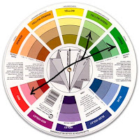
My process in going about my color choices has recently changed a bit.  I am becoming more and more aware of how they work together, thanks to having to remember and reteach myself for my advanced students.  I finally purchased a color wheel.  I know, I've been painting for about 10 years and haven't owned a color wheel.  It's amazing how much information a little and simple wheel can give!  My color has always been instinctive, and I've never had many issues with that, but to be able to explain why I choose my colors is a new matter.  To myself, my students, and now you.  So if you don't have a color wheel I advice you get one.  Mine was only about $3 at Hobby Lobby. 

It's small enough to go wherever I go, and it has basic color theory right on the wheel.  A great visual resource to have around.  Plus, I don't know about you, but I enjoy moving it around and interacting with it. 


So based on that, I sat and actually decided before painting what my color scheme was going to be.  I decided to go with a split complementary palette.  I enjoy complementary because both colors enhance one another, which helps with getting the soft glowing effect I strive for.  I also took into consideration the time of year I'm creating this piece and the subject matter.  One, I'm painting a fairy so naturally I want colors I can have fun with but can also be brought down to a earth tone.  Second, my fairy is holding poppies, which are a red orange color.  The complimentary of red is green.  Third, it's the end of March which means spring!  The first flowers that are popping up near my home are a blue purple in color.  And according to my color wheel, I have almost a perfect match after listing my objectives.


On my color wheel the split complementary closest to what I want is Yellow-Orange, Yellow-Green, and Violet.  What's nice about this, although red isn't one of those colors it becomes my accent color to enhance my greens.  I was excited about this selection because with Yellow-Orange I can also use browns!  And with my violet I can bring in some blues subtly.  A perfect match that allows many possibilities!  Plus I now have a visual helper when trying to make the colors I envision in my head, and to compare whether I've achieved that color or not. 


When I paint I don't lay out the colors, meaning I don't prep them before I begin.  I mix the colors I want as I go.  For me it's all about being in the moment as I paint.  If I do too much thinking before hand it tends to take away the "spirit" of my process in relationship to what I'm painting.  I want to make sure I stay connected to, or within the imagination of the subject.  So when I'm painting I play music that relates to the world I'm creating on paper.  I try to pretend I'm the fairy (sounds silly I know), or play out in my head a day in her life as her, envisioning what her personality is, her character, etc.  I am supposing this is why others are able to connect with my work as well.  We don't relate to what I paint because of the subject matter (I've never truly met with a fairy face to face, or walked through their world through their eyes), but maybe because of how I paint.  The life that is breathed into the subject through water and paint, and for me most of all through the breath God breathes through me.  I truly believe God works through us to speak to others, especially through art.

Tip: Take it slow!  You definitely want control as you paint inside your lines.  There is absolutely no rush, tho you may be tempted to.  Get in close with your 3/0 brush and with your distance from the paper to your face.  Be emerged with your painting and get lost in the action of painting.  Always remember, you may want to dab your brush on the paper towel before you go to the paper from the palette.  Too much water/paint in your brush can make it difficult to stay in control of your watercolor.  

When I begin my base colors I make sure I mute them down with water so I can build them up as I go.  If I make the colors too dark that leaves me restricted to what I am able to do in the future.  Even if I can barely see the color, at least I've gotten rid of the white paper.  The white of the paper can be distracting and sometimes makes it difficult to envision the final painting.

Tip: Don't get bogged down or unmotivated with the base colors.  There have been times in this part of the process I loose interest in what I am painting because I'm not seeing the bold colors I want.  Just keep reminding or telling yourself this is going to be a beautiful work of art and get excited for the end product.  Like running a race, your legs might hurt in the process of running, but getting to the finish line is satisfying.

Here is what I ended up mixing for my colors.  I will use these throughout the painting, and as I build my painting up I will use less water and more paint to create bolder color.
(click on the image to view larger)


I also want to say, if you're unsure or anxious about your color choices, you can always do a quick color study!  I have in the past, and usually do for basics when doing a book project (colors for characters, environment, etc.).  It can be fairly quick to do!  Just scan in your image, take it into Photoshop, cut your image onto a new layer, make the layer "Multiplied", add new layer underneath, and begin to add basic color.  If you don't have a scanner make several photocopies and use watercolors or colored pencils to layout your color plan.
Tip: Go to any store that has a paint section and grab paint swatches.  There are usually color combos already made to take out a lot of guess work.  These are great to have around for color inspiration or planning.

Next, time to add the shadows!

Mar 25, 2010

Poppy Tutorial - First Paint

 To view the first steps visit the post H E R E

Before I get into how I paint, let me tell you what I use.  I have for some time really enjoyed Windsor Newton watercolors.  I use mainly Cotman, but have several Artists' Water Colors.  I also use Grumbacher every now and then, but not often.  I prefer tubed paint, I feel like I have more control this way.

The colors you'll find in every painting of mine are:
Dioxazine Violet (Artists' Water Color by Winsor Newton)
Vandyke Brown
Alizarian Crimson Hue
Cobalt Blue
Rose Doré (Artists' Water Color by Winsor Newton)
Yellow Ochre
Prussian Blue
Hooker's Green Dark

     Primarily there are two brushes that I use, although I have many.  This painting isn't larger than 8x10, so in my world there isn't any need for much bigger brushes except maybe background.  But that's a different painting.  For now, it's these two.

    Not 100% sure of the size for the blue one, but I believe it's a 2 or 3 round by Winsor Newton, and the red one is a 3/0 round by Princeton.  I suggest having a wide range of sizes, you never know what you'll need.  The largest I own is a 12 round.  I choose round because I find it easier to blend and the brush holds more water...in my opinion.

    Which leads me to my final thought before we go into painting.  It's more of a disclaimer.  This is my way of painting.  I am self taught in watercolors and I highly encourage learning all techniques possible before deciding what works best for you.  As a teacher myself, it's important to try everything, especially in watercolor.  It has so many possibilities, and you probably won't learn them all by one teacher.


    The very first thing I do is establish a background with color.  With my number 3 watercolor brush I choose muted colors that I know are safe, meaning if I choose to go with a different color than what is down, I should still be okay.  Remember, once color is down, you can never fully remove it.  Also choosing a muted color keeps the background in the back.  Colors fade as the go back towards the horizon line because of our atmosphere. 

    I use a lot of water, a constant back and forth from the water, to the paint, to the water, to the paper, and repeated.  Always start with really watered down color, you can always add paint, but rarely subtract it.

    You don't need to have complete control of the medium here, the more loose you are the better!

    Tip:
    I have found keeping all of my paints, brushes, water, and paper towel on the side I write with to be very helpful!  Remember, water, water, water! 

    When you get to those small areas, like around the hair here, while the paint is still very wet I switch to my 3/0 brush and pull the paint already on the paper into my tiny areas.  If there isn't enough color I light dip the brush into the paint and add a wee bit more.

    Tip:  If you have too much water in a small area, dry your brush and return to the wet area.  Your brush will soak up any excess paint you don't want.  This is also very helpful in blending.  Remember, your brush is meant to hold water like a sponge.

    The next area I focus on is the skin, starting with the face.  I believe my work displays a spirit or soul, and the spirit of that painting is the subject to which the piece is about.  So I want to get that worked on just as much as my background.

    After I decide where my light source is coming from I begin using my 3/0 brush.  I use Rose Doré for the base of all my skin tones no matter what color they are in the end.  The reason is because red works in highlights and in shadows, it's a great undertone in my opinion.

    With water mixed in with my paint I begin using the Rose Doré to layout where my shadows are.  I personally enjoy "maps" when I paint, because I rarely do color studies.

    Tip: Apply the paint where it would be darkest.  Look at eye closest to us, above the cheek, that's where I laid down my red.  Take your brush to the water, rinse it, lightly dab onto the paper towel, go back to the painting where you laid your red, and pull it.  Dry your brush and go back and pull again.  Now you're blending!


    Take your time, stay loose, and don't freak out if water gets where you don't want it.  If you don't want water somewhere, or are worried about that, look into using masking fluid.  I found out a while back I prefer not to use it, but that's my preference.  I know many artists who use it and their work is gorgeous!

    Find a rhythm to how you paint, you're working with an element of the earth, not a machine.  Always keep that in mind as you paint.  The best way I learned how to paint was first allowing the watercolor to do what it wanted, then figured out how I can control what it already naturally wants to do.  If you go into trying to control the medium, it will most likely make you leave your painting or worse yet, throw it away and never return to using watercolors.

    Next step: getting rid of the white remaining!

    Mar 24, 2010

    A Poppy of a Tutorial

    Every now and then, once in a blue moon, I post the progress of my work.  I've been illustrating so much for children's books lately that after painting "Day of Joy" I just needed to do another being with wings.  I still kept the youthfulness and quarky stylings that I would use in childrens' book illustration, the whole combining the two.  Now I'm rambling.

    So this is "Poppy".  I like to sketch with my students during free draw at work (about 15 mins at the beginning of class we "free draw" to loosen up.  They can draw whatever they wish.)  I highly suggest it if you're not already sketching before you dive into a project.

    And instead of using my mechanical pencil and moleskine sketchbook, I decided to use what they were using.  HB pencil, pearl eraser, and copy paper...I was reminded of jr. high...those were the common tools.  Sometimes it's good to go back to basics.

    On the left is the sketch I did in HB pencil.  I used to just go crazy with my fashions, but have mellowed out a bit lately.  So I wanted to bring that back in.  I may have gone a bit overboard, but I'm lovin' it!  Kids loved it too.  :)  It's a great example of where practice, practice, practice will take you.  I personally love detail, I think the more detail you have the more engaging the piece becomes.  Tho I will say, negative space is just as equally important.

    I took the sketch from work (which was a good size, about 5x7) and placed it on my lightbox, and taped it down (corners).  If you don't have one, get one!  They cut a lot of work time in half and now after buying a higher grade box, I don't need to ink my work anymore!  I'm a pretty messy sketcher, so the lightbox allows me to trace over my sketch with clean crisp lines.

    I laid my pre-cut (cut it so that I would have enough white space around the image when I'm finished painting) Arches 140lb hot press paper on top of the sketch on the lightbox with the light on.  This way I can see exactly where my lines are going.  Taped the watercolor paper down, again...just the corners.

    After I have everything I want from the sketch, I turn off the lightbox and continue working on the final line art.  I draw pretty light at first and have pretty good confidence in my line quality.  I say that not to be big headed, but that I rarely do backgrounds or major character development on separate sheets of paper.  I typically do them right on the watercolor paper without prep.

    One last thing, although it's becoming more frequent, finalizing a sketch into watercolor is still pretty new to me.  I think one of the reasons why I haven't is because, I don't know about you and fellow artisans, but I always prefer the sketch over the final line art.

    Why I don't just use that, I dunno.  Obessesive over clean lines...
    View the first steps to adding paint now!

    Mar 22, 2010

    IF - Retired

    "Day of Joy"
    watercolor | 2010

    The thought behind this; the kitten and the angel work and play all day long, now time for a night nap.

    Much went through my head as I contemplated what to illustrate for this word.  The very first thought was a kitty pooped from a day of playing...inspired by our new kitten Talor.  But then as I thought about it some more, I thought of someone praying, or an elderly person (since I don't have much of that in my portfolio).  It just wasn't meant to be, I sat down and continued with my idea, right through the end.

    I created a shape I don't use very often, and played more with beings interacting.  Although they aren't awake interacting, it was still a challenge to get the angel to look like she is actually laying on top of the cat.  The other challenge was the cat.  I did use reference, unfortunately pictures of Talor in this position wasn't available until after I had draw it, but the photo I found worked.  A common pose for any kitten fast asleep, including Talor.  
    I enjoyed the process of this piece, and the colors.  I felt it needed a slight push in photoshop, so I boosted the levels just a hair to add a stronger contrast.  I tried to build it up on the paper, but it just wasn't going to happen.

    Mar 18, 2010

    New Poster Print

    "Kaleidoscope"
    watercolor | 2010


    New poster print now available at my zazzle shop.  It's a bit different than your fairies or mermaids by far.  I was asked to create a cd cover for some worship music, and after finally falling in love with the piece, I just had to share it with everyone!  It is my hope to also offer this image on many other items, so keep going back to the zazzle shop, here, or my Facebook fan page to get updates on what has been created. 

    The image of course, is Jesus, looking up to the heavens.  There are other images within the piece, a fish, flower, birds, and a human hand.  I truly hope you enjoy just the pure beauty of this piece and the joy it brings to the heart.

    Mar 17, 2010

    Enter to Win!

    To view the winners go H E R E 

    The new Fantasy Art Collection book by Pure Inspiration has finally arrived to my doorstep!  And I want to share it with you.

    So I'm holding my very first drawing where you can win this gorgeous hardbound book featuring 16 of some of your most beloved fantasy artists!  To name a few featured are:
    * Linda Ravenscroft
    * Sheila Wolk
    * Josephine Wall
    * Kinuko Y. Craft

    Just to name a few!  These are artists I look up to and take inspiration from.  The most amazing part for me is...I'm also featured in the book!  So I will be hand signing, personalizing, and dating the inside cover for the winner. 

    If you're interested in purchasing the book please visit:
    http://www.fantasyartcollection.com

    To Enter...
    ----------
    All you need to do is add a comment to the post and in your comment please list your email address.  All email addresses will be entered on April 1st into a random drawing (provided by Random.org). 

    That easy!!  The book truly is beautiful, with embossing on the front cover and back.  Full bleed pages of art, and some snipits about your favorite artists' inspirations.  Quite the treasure and it could be yours for free!

    Mar 16, 2010

    Inside Look


    Another look at the moleskine.  I had a hard time with this week's Illustration Friday.  I won't show the two pages that has the word "BLAH" written across them.  Kinda embarrassing, I haven't done that for a long time.  I had the concept in my head but no concrete image.  So this is what I drew before I finally came up with the dryad and the mouse.

    I have to say a huge thanks to my fellow IF children's book illustrators!  You definitely got my motors running and my brain finally decided to turn on and work.  You guys are always such an inspiration!!!

    Mar 15, 2010

    IF - subterranean

    "A Visitor"
    graphite pencil | moleskine | 2010

    "It was very sweet of Mr. Mouse to visit the young dryad."

    Mar 13, 2010

    Inside Look


    Some sketches I did today in my moleskine.  I miss drawing mermen like  this...used to all the time.  Realized I need more practice drawing mens  backs...so did a wee bit of research and documented what I saw, then  applied it.  Looking forward to hopefully doing more.  :)

    Mar 12, 2010

    New Studio Kitten

    Today was to be a quiet relaxing day, and then when Brian got home we decided (last night) to go out to shelters and find our next kitty.  Little did I know what the day had in store. 

    Candace gave me a call to go out to lunch.  As I was getting ready I thought she might like to go look at kitties...just to browse what was out there before Brian and I went.  So we had lunch then headed over to the Animal Rescue League's (ARL) west branch.  Very little was there...a 10 month old was their youngest.  Without much twisting of the arm Candace and I then decided to go to the ARL main shelter near Ankeny. 

    As we stepped in to the cat quarters the first lovely was this little lady to the right.  She is six months old and the previous owner named her "Tiger".  Uh huh, that wasn't going to stick in our home.  But she wasn't ours yet.  We looked at all of the many others, so CUTE, but when asked who I wanted to see, it was her.  She snuggled right with me and seemed to have no nervousness nor fear of me whatsoever.  A good quality. 

    After texting Brian, arranging them holding her for us until Brian got off of work, getting there, etc. etc. etc., we brought her home.  I have an AMAZING husband who in such a short time would make and allow such a commitment with our lives and money.  It wasn't my intention to get another cat from the ARL (where Madie is from), but it just happened.  It wasn't my intent to pick a kitty without Brian, but it just happened.  He liked her when he met her and made it simple.  He just said "Let's do it!" with enough certainty that I knew we were all good.  Even buying everything we needed, he said "I rather LIVE then worry about money."  Did I mention I love my husband?!

    So here she is, now sitting on my lap as I type (minutes ago trying to type with me), finally starting to settle down after a long night of transporting, being held, and playing...oh the amount of playing!

    She is separate from the rest of the apartment, and away from Madie except through the base of the studio door.  Yes, I'm crazy for having her "safe room" my studio, but Madie rules the rest of the apartment and spends the least amount of time here.  I'm not worried tho, whatever Talor, that's her name, decides to rip, break, or chew, it's nothing too precious.  Those things are put away.

    Let me introduce the newest, youngest, member of our family and the new studio kitten...Talor.  :)

    Mar 9, 2010

    IF - Brave

    "Buzz Ride"
    watercolor | 2010

    It was a known fact that Thumbelina was brave for her size.

    Mar 3, 2010

    IF - Perspective (WIP)


    So far got a sketch!  Woot! 

    This is a rendition of a piece I did in college.  Hopefully when (if) I finish it I will post the old one along with my new one.  Both VERY different styles, but same story.  :)